Info
UX/UI Design Intern at Logos News
1 Month, 2020
Logos News, a niche player like Medium, is an online publishing platform focusing on individual journalists and political opinions.
Team
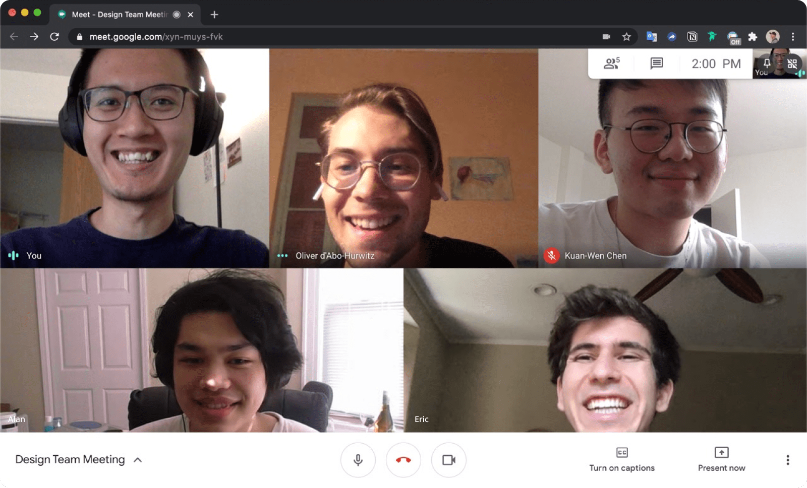
CEO – Oliver d'Abo-Hurwitz
PM – Alan Deng
Designer – Me
Developer – Raymond Deng
I led the design process, from defining project goals and success metrics, synthesizing the existing UX research reports, conducting exemplar analysis, iterating, to wireframing and prototyping. During the whole process, I constantly gained feedback from the team.
How might we create a single, intuitive place for writers to manage their audience growth by a month for the beta launch?
In a short timeline, Logos News wanted to kick off the subscription model to help our writers earn from their work. As a solo designer, I was responsible for building a subscription system to push our beta launch and gain more feedback.
I designed the system from 0 to 1 and handed it off to the developer.

It started from a new business need: a subscription model
As a young startup, Logos News began adopting the subscription model to grow the product and to re-invest to our users. The new model enables our writers to grow because the subscription payment from readers goes to their pocket directly.
To grow with our new business model, we have three business goals in mind:
- To promote writers to start their paid subscription
- To make it easy to set up a paid subscription
- To motivate and support writers engaging with their audiences
Translating existing user research reports
Combining the data from existing reports and my interviews, I was able to capture how writers were using our product and what value they took from it. Some of the values our writers expected to our new business included:
→ Will not distract them from writing and engaging with their audience
→ Want to see how their paid plan affects normal readers and paid subscribers
→ Provide more information about their article status
Learning from exemplars
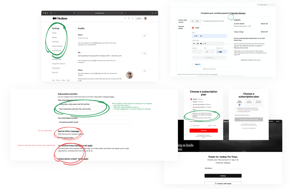
I looked at how different platforms design their subscription settings and their different paywall designs for different audiences. Some were Medium, Substack, Patreon, The New York Times, etc.
→ All the exemplars provided one-page settings for the most convenient
→ The settings started from a very easy one to a more advanced one
→ The paywall allowed readers to opt-in later and know more about an author
Principles derived from insights
Based on the insights from users and examples as well as the business goals, I set two principles that serve as guidance for my designs and iterations.
Clear communication of the value and consequence of settings
Organized information for easiest performance
Iterate, iterate and iterate
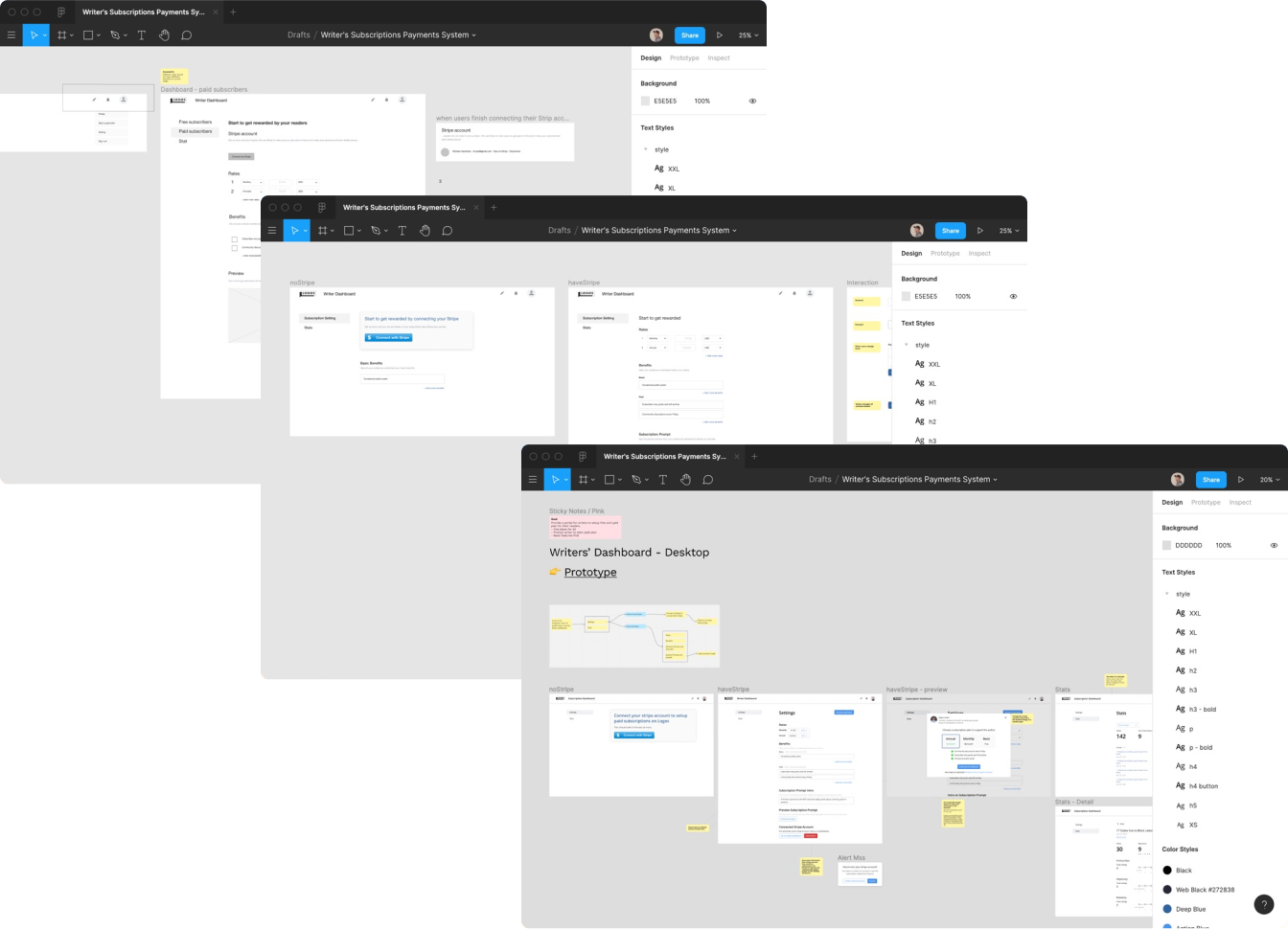
Having all the needs and requirements much clearer, I started by creating wireframes and discussing the ideas with my team. I firstly focused on the alignment across the team on the user flow and elements we wanted to include. When the consensus was achieved, I continued to fine-tune the detail with feedback from the team.
Final Prototype
Major design decisions
During the iteration process, there were three parts that I explored much more and pushed our ideas forward. They are Paywall Preview, Paywall Prompt, and Stats Page.
Paywall Preview
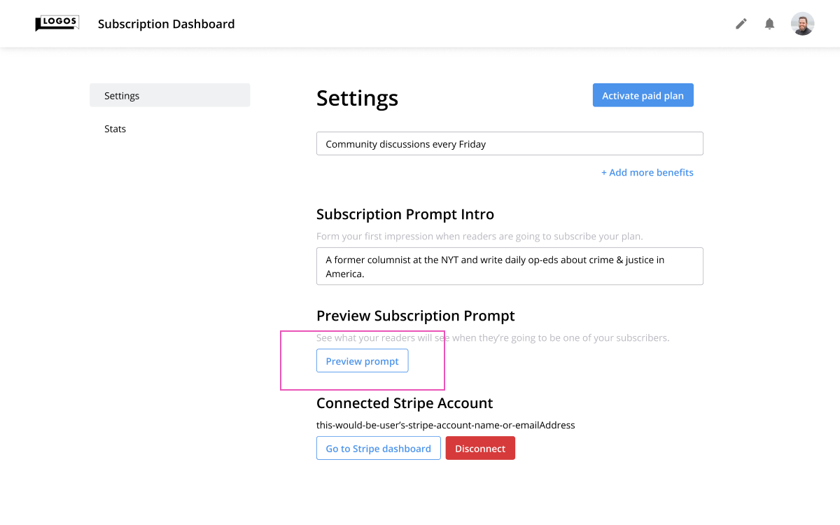
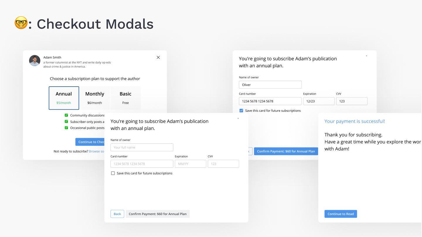
I was trying to make the preview modal show with the settings (design B), or upon a user clicking a button (design A). The design A won because it aligned with our business goal of making the setting easy and design principles more.
Paywall Prompt
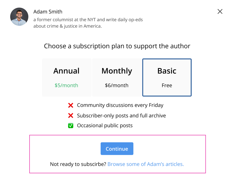
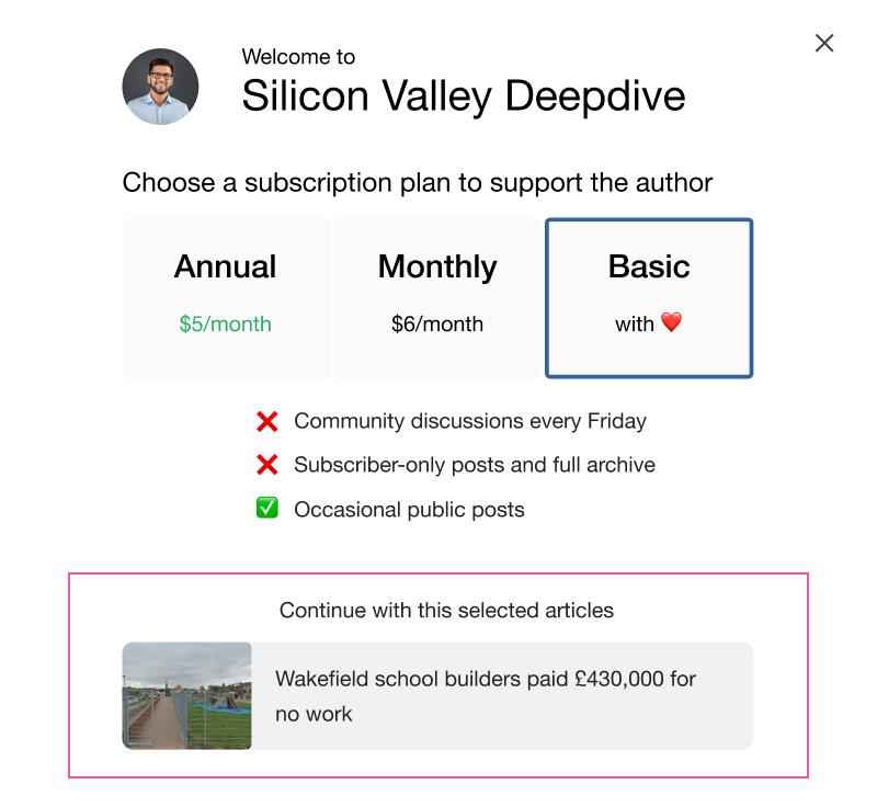
Paywall Prompt is the modal in Paywall Preview and the one that readers would see. I was trying the options when readers choose a basic plan. The design A won because of its rich directions (staying at the current page, and going to an author's page) and because it encourages our users to subscribe instead of going to another article.
Challenges and Compromises
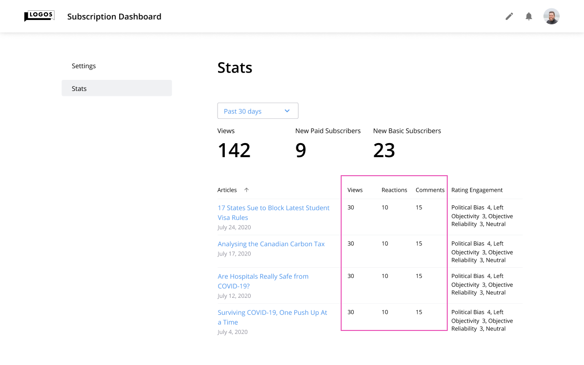
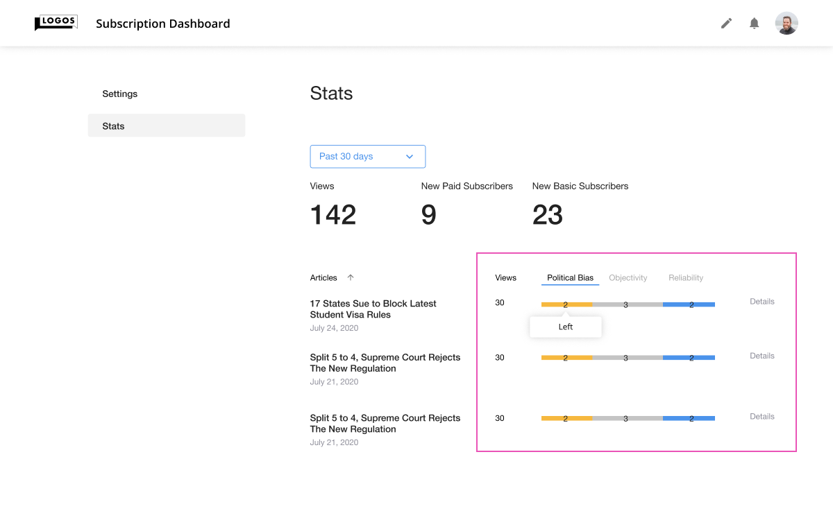
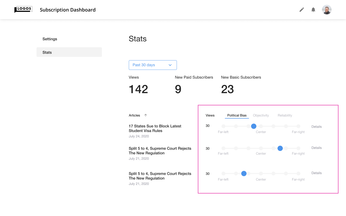
One of our challenges is the lack of resources and time as like most startups so I have to reiterate my designs. But my goal is still the same: providing more value to our users and meeting their needs. When designing Stats Page, I explored different options of visualizing readers' reactions to our writers. Eventually, I scoped down to showing the data in text format because we had other prioritized features and couldn't develop a new module and meet the timeline.
Revisiting our business goals
At the very beginning, we talked about our business goals, but how does the design relate to the goals? I referred to the Google Heart framework and came up with the success metrics. Even though I didn't participate in the launch before my internship ended, the metrics defined how we would determine future success.
1. To promote writers to start their paid subscription, which refers to Adoption
→ Days to first click the subscription management item when a user opened the homepage
→ Numbers of subscription plan activated
2. To make it easy to set up a paid subscription which refers to Happiness
→ Time to stay at the page
→ Survey of ease-of-use level
→ Low support contacts
3. To motivate and support writers engaging with their audiences, which refers to Engagement
→ Stats usage frequency
→ Preview usage frequency
How the core design impacts other corners
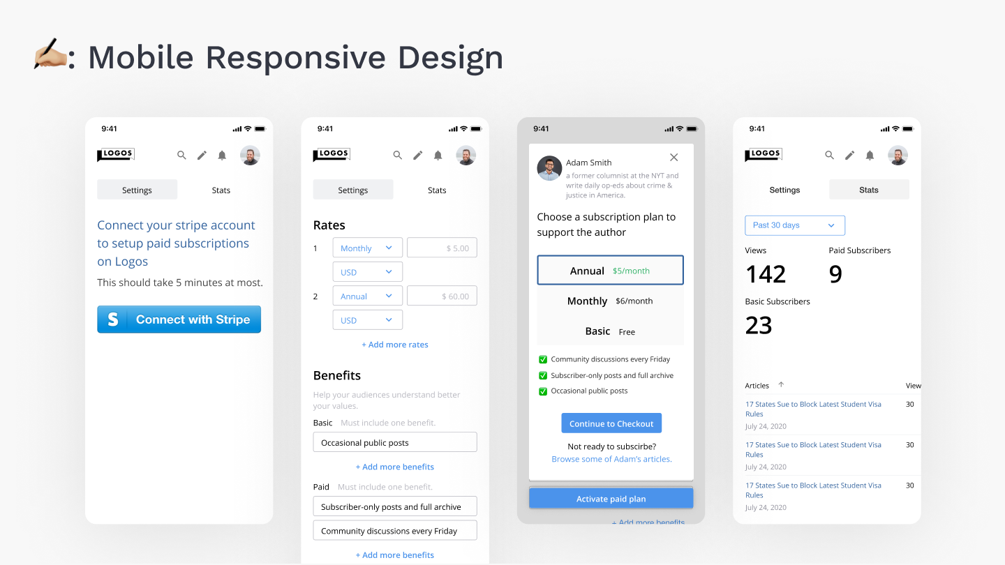
Because the new business model not only required the brand new settings but also impacted many corners of our product. After finishing the desktop design, I continued to work on mobile design, a new experience of Writing Page, and more.
Next steps
The finished design has been well received by the team and leadership and is ready for the beta launch. However, there are still improvements that can be made. A writer should be able to filter the stats data and control the settings, from a personal profile to a subscription plan, in one place.

Learnings
→ Articulating my design decisions with the audience’s language, like business impact
→ Familiar working with a team in a remote and agile environment
→ Always making the design file well-documented for better handoffs
Thanks to the team for a wonderful summer experience!
