Info
Coursework in Interaction Design Practice, 2019
Spondsered by Lucidchart
3 Months
Team
Jinchuan Zhanghe, Kamala PT, Shikhar Mangla, Chien-Chun Wu (Me)
I was a UX researcher, designer, and strategist. I particularly enjoyed designing and strategizing in this project as well as supporting my teammates in research execution.
How might we ease users into learning drawing diagrams and use Lucidchart to increase retention rates?
In this semester-long project, our goal is to image and develop a concept that improves the first diagramming experience for one type of user of Lucidchart, an online diagramming platform that anyone can create and share diagrams with the internet and a browser.
Our solution: Contextual tips
After understanding our users, we asked ourselves a question: How might we ease users into learning drawing diagrams and use Lucidchart to increase retention rates? Our response after rounds of exploration is contextual tips on the website.


We went through a double diamond process

Lucid wanted to improve onboarding because of its impact on user growth.
With 14,000 new users sign up and try Lucidchart each day. Lucid wants to create an onboarding experience that helps users become familiar and productive with the product in no time. By doing so, the users have more chances to retain, upgrade, and spread the word about Lucidchart. All would lead to the growth of Lucidchart.

Outlining the research plan
We conducted a mix of qualitative and quantitative research to best understand the problem space and identify opportunities where we could create an impact.

The backend data shows that users still feel unconfident after learning a while
We started by conducting a heuristic evaluation of the software and formed our assumptions of several problems, including a lack of tools' description and poor understanding of features. We then noticed these issues happening on shapes and formatting while digging into the quantitative data provided by Lucidchart.
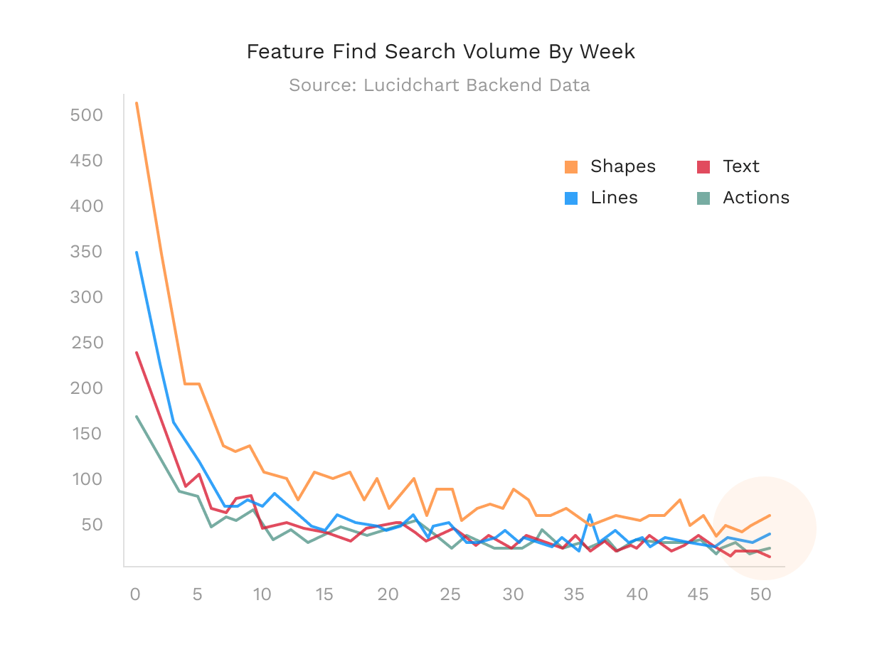
We pointed out that users have little confidence in using the software even after a while. From the data analysis, we saw the fact that even after 50 weeks, users still make a lot of searches for “Shapes and shape formatting” and “Lines”. This also happens to be an obstacle for users to become pro visual thinkers.
Users tend to skip the tutorial and are eager to create
Throughout the user interviews and NPS data, we realized that users want quickly get into a canvas and draw out their thoughts. We also noticed some issues with the symbols of different diagrams. Users aren't quite sure about what they mean, when to use them, how to tell a story with them.
The core value a visual communicator looks for Lucidchart, as a visual communication platform, is making their jobs easier, faster, more efficient. — one of our users
So we focused on effective learning
Our research and insights helped us identify the most crucial problems users were facing and helped us define our design implication.

We concluded...
The best way is to doing and learning, not to go through a tutorial or something. If we could provide Lucidchart users a more contextual guide while diagramming, then we could improve the onboarding experience for them.
Onboarding is a learning process. It's a recurring and continuous process. From the moment the user signs up, every time the user learns to use Lucidchart and learns to draw diagrams, onboarding occurs. It's particularly crucial for non-seasoned and diligent diagrammers.

Design principles that drove our decisions

Getting inspiration from how people learn new knowledge online
We learned that context matters. Learning would not begin without any initiative. Another thing is that we saw the fact that people are visual animals. For example, people prefer to watch a tutorial video rather than a text-heavy article.

Rounds of brainstorming
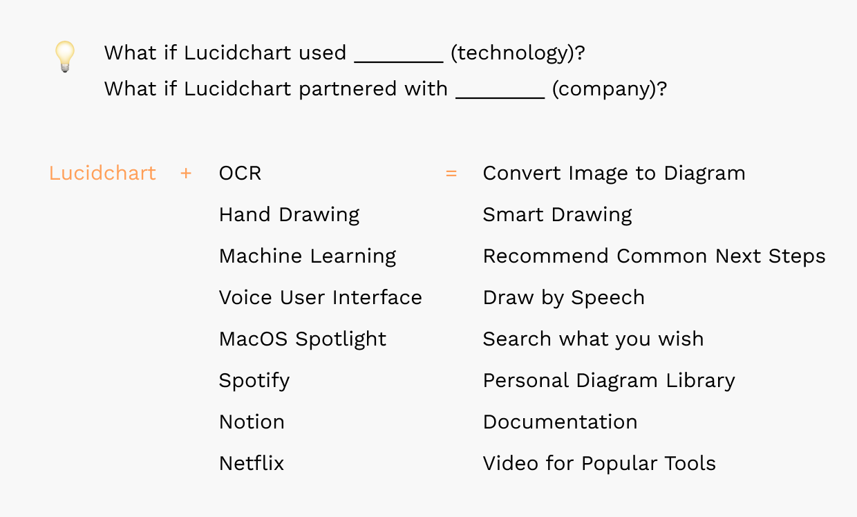
Narrowing down to the GIF idea
We stepped back to view our ideas to find the one fitting our goal—delivering a feasible solution for our client.
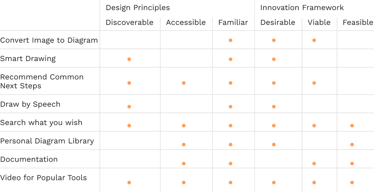
By making the wireframes, we came to two conclusions on further design. The first thing is that the video idea betters off because it leverages the findings of visual animals and contextual learnings. By giving the knowledge incrementally, we believed this could build users' confidence successfully. The second thing is that videos require many resources, so we turned to a much simpler alternative—GIFs.
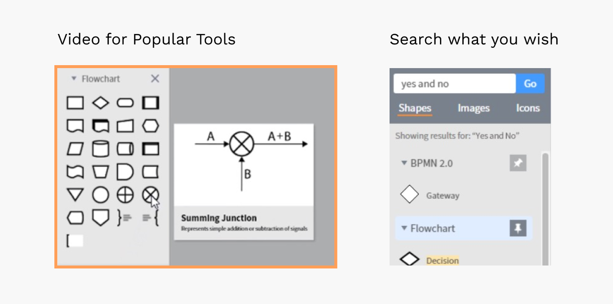
Refining the interaction details
We developed high-fidelity prototypes to test and gather feedback. The content here will focus on the design elements we iterated, rather than the whole screen.
Iteration #1
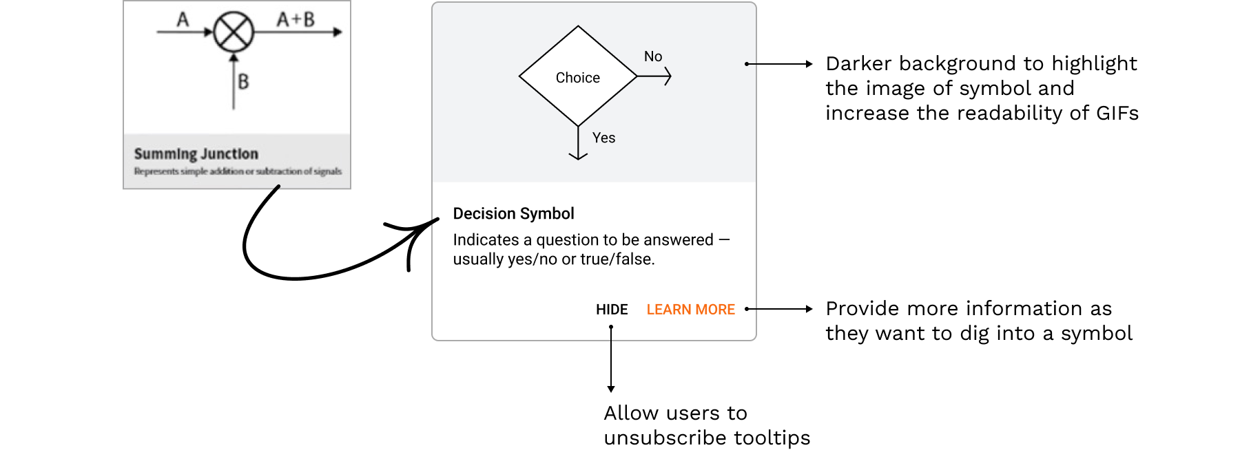
Iteration #2
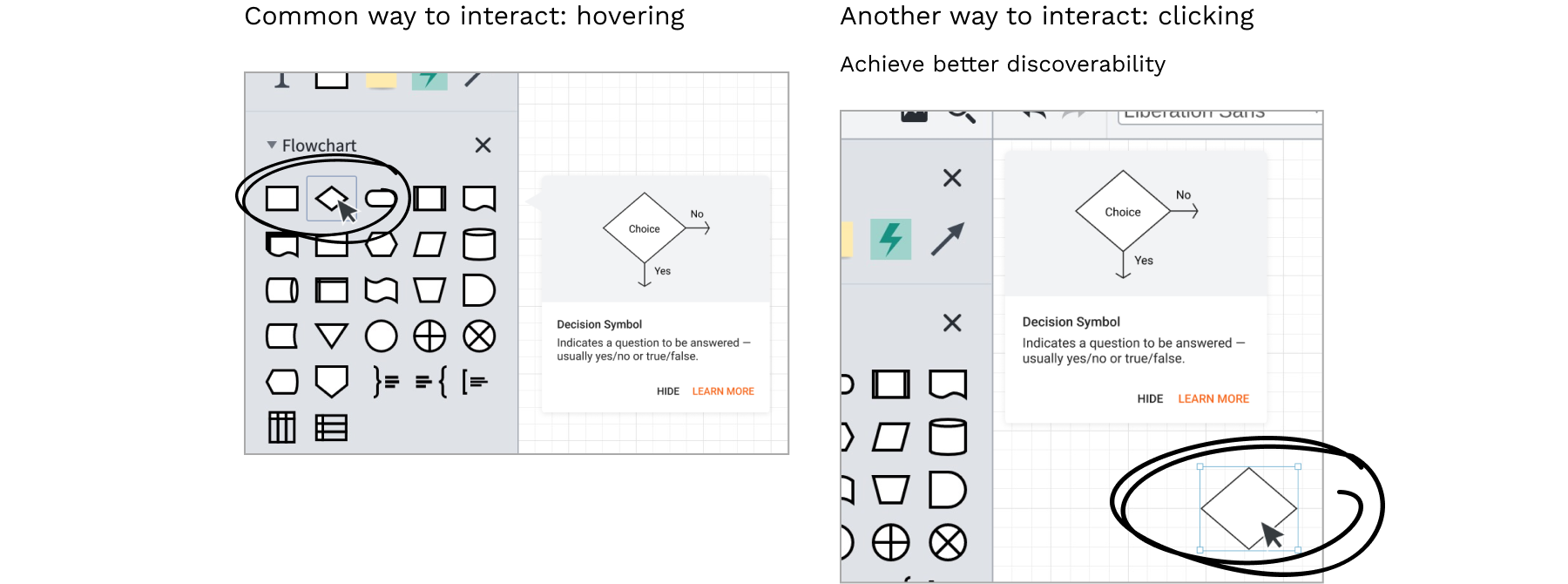
The hovering interaction way fits the scenario that users learn how to diagram, which matches our research finding. On the other hand, the clicking behavior prompts the users to learn diagramming while they are visualizing their thoughts.
Final Design 🎉
We learned that context matters. Learning would not begin without any initiative. Another thing is that we saw the fact that people are visual animals. For example, people prefer to watch a tutorial video rather than a text-heavy article.

Conceptual A/B testing

To test one of our concepts, the contextual tooltips, we conducted a minimal version of A/B testing with 6 participants and had them to do identical tasks. We applied paper prototyping to generate a set of tutorial images of the flowchart, the most commonly used diagram, to best simulate the changes. We chose a common daily activity—making coffee in the morning—as the flowchart's topic.
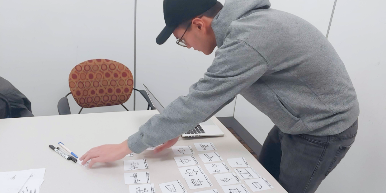
We finally measured with three metrics

And the result was positive
The contextual tooltips increased the speed of learning. The diagram created using GIF examples was more accurate and consumed less time (3 minutes) compared to the one created with exact shape names (5 minutes). Our participants agreed that the GIFs helped them feel more confident when they were creating diagrams.

Takeaways
→ Think big but start small.
As a designer, it's great to think wildly and be visionary to have better ideas on the table. In this project, I'm more familiar with framing the solution space and finding the best one with existing frameworks. By doing so, we ended up having a concrete idea that fits in the intersection of business, technology and users.
→ Listen to others carefully and patiently.
Working with a group of people with different backgrounds, I found that the most effective conversation is not teaching others but facilitating the process of thinking and reflection. Also, even with my previous experience in UX research, I still learned a lot from others when we discussed business alignment.